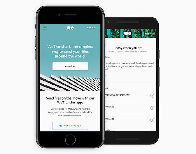
File sharing service WeTransfer has unveiled a redesign of its identity, logo and website. This is the first identity revamp the company has done since launching in 2009, and includes the decision to drop “transfer” from its logo and “start from scratch” with a stripped-back two-letter symbol.
The company was founded on making it “dead simple to send digital goods,” explains Thijs Remie, vice president of design at WeTransfer, “and we’re now looking towards the future, exploring all possibilities. This is reflected in the new logo”. It also represents the community-driven nature of the service, which is widely used by creatives and features a variety of artists on its site.
The logo no longer has roots in the typeface used for the original identity, Thijs says. “We started with an empty canvas and a mission to create a symbol that captures the right personality, one that is technically well-executed, and can clearly be read as ‘we’.”
The design began in-house, with the company’s creative director Laszlito Kovacs drafting the concept and exploring initial options. Then the team worked with Bold Monday’s Paul van der Laan to work on the finer details, aiming to create a logo that looks “well-balanced and exudes its personality at a small size”.
“Together we revisited the entire rationale, and Paul helped us sharpen our ideas on the logo,” Thijs says. “Ultimately, and after numerous iterations, he managed to really nail the execution. Getting there was anything but a straight line, although the end result might seem perfectly sensible and a clear evolution of its predecessors.”
Outside the logo, the wider identity has been revamped from the inside out, to reflect how the service has evolved since 2009. It has a new colour palette, updated typography, a cleaner interface, a bigger message field that scales as you type, and a set of shapes – dubbed “particles” by the design team – to freshen up the look of the site, plus a set of spot illustrations commissioned for “key moments of the transferring process”.
“Around the core utilitarian aspect of WeTransfer is the experience of using it,” says Thijs, “which goes beyond the easy-to-use aspect. One could argue that the usability and the look & feel are of equal importance to us. We continue to allocate one third of our ad inventory to highlight photographers, illustrators, musicians and other artists. I think our new visual identity embraces creativity and the community.”
 |
| WeTransfer: evolution of the logo |
 |
| WeTransfer: annotated changes in the logo |
 |
| WeTransfer: shape explorations by Paul van der Laan |
 |
| WeTransfer: sketches by Laszlito Kovacs |
 |
| WeTransfer: new homepage |
 |
| WeTransfer: mobile site |
 |
| WeTransfer: homepage using set of shapes, or “particles” |
 |
| WeTransfer: new design of the transfer box |
 |
| WeTransfer: updated upload spinner |
See
See also
- Why the shape of a company's logo matters
- Modern Art Movements To Inspire Your Logo Design
- Excellent Logos Created with Helvetica
- Euro Sign Design
- Harvey Ball. The designer of "smiley" icon
- Doodles from Google
- A Guide to Choosing Colors for Your Brand
Resources
- Wetransfer redesign logo identity and website
- Wetransfer unveils new logo and brand identity
- New logo for wetransfer done in house with bold monday
- Wetransfer
- Laszlit.com
- dribbble.com/laszlito_k


WE love logo redisigns, Μπράβο για το όμορφο άρθρο!
ΑπάντησηΔιαγραφή