

Picture yourself as a smoker in a foreign country where your favorite brand of cigarettes is unavailable. You walk up to a store and run a cursory glance at several packs on display. If you smoke menthol cigarettes, you instinctively lean towards all the packs in green and pick one. Conversely, if you prefer cigarettes with a stronger flavor, you pick the red pack or if mild cigarettes are your choice, you head towards all the white packs on sale.
Color plays a vital role in defining and communicating a brand’s personality and this is widely evident across categories, be it perfumes and alcohol or medicines and banking. However, the psychology of color as it relates to persuasion is one of the most debated aspects in marketing.
One of the critical questions raised at the brand development stage is whether a brand must adhere with stereotypical color associations or instead, pick a color which best articulates a brand’s personality and sets it apart from the competition.
This is a catch-22 predicament. To build on the example of cigarettes cited earlier, imagine you are launching a brand of menthol cigarettes, a product category which has intrinsic, deep-rooted mental connections with the colour green. It would be futile to challenge and redefine colour associations within the category and at the same time it would be detrimental to look like the entire gamut of competitive brands with green packs on offer. Pray, what does a brand manager do?
The answer, in this specific case, would lie in walking the tightrope between relevance and distinctiveness. To exemplify this point, let’s take a look at the cola category. Coca-Cola was introduced in 1886 and as a first-comer, the brand had the unparalleled advantage of defining colour associations in the category and chose red as its primary colour. Pepsi, which was introduced later in 1893, followed suit with the logo in red. However, in 1940, Pepsi redeveloped its identity and was astute in retaining the color red for relevance, while introducing blue as a secondary color to stay distinct. Additionally, the colour blue, red and white represented the American national flag and drove patriotism with the advent of World War II.
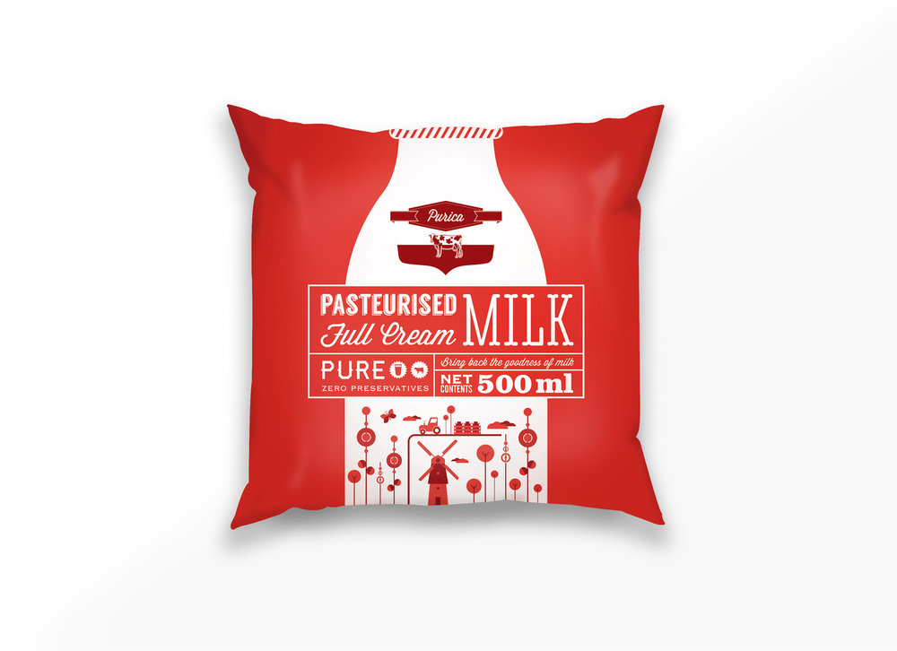
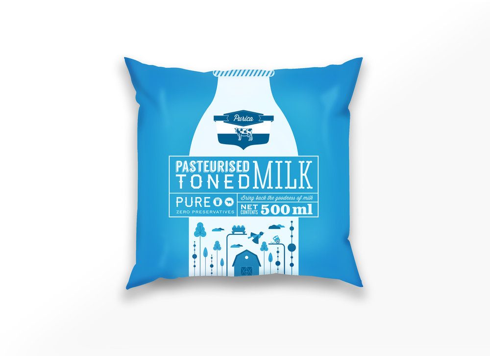
Another example can be cited from the dairy industry. While working on packaging for Purica, a brand of milk, we noticed that all packs had a predominantly white base with blue and red as a secondary color for toned and full cream respectively. We stuck to these color associations for relevance, however, we flipped the weightages; we used blue and red as primary colors to stay distinct, with white as a secondary color to stay distinct. This approach helped Purica stand out and communicate its variants in a bold fashion, without looking like the rest of the packs on the supermarket shelf.
However, what holds true in one category might not hold true in another.
Telecom service providers, for instance, perhaps make use of the widest array of colors. From Red (Verizon and Vodafone), Orange (Orange Telecom) and Blue (AT&T) to Yellow (Sprint), Pink (Deutsche Telekom) and Green (Etisalat).
The advantage in relatively newer product categories is that they often don’t come with baggage and this can prove to be an advantage for a designer and open up a wider range of creative possibilities.
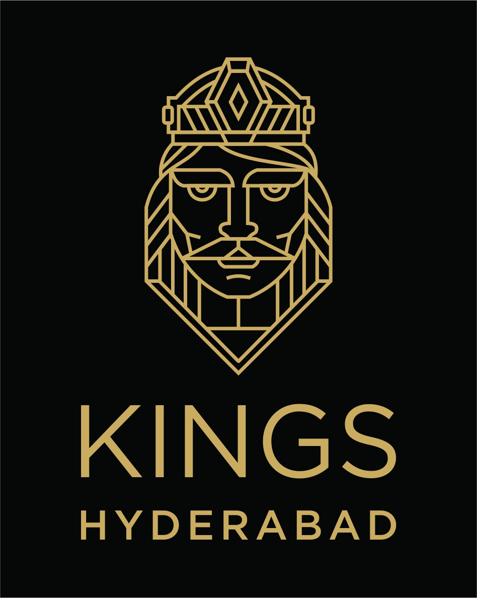
Case in point: The official Indian Poker Sports League was launched only last year and we were commissioned with the task of designing the identity for Kings Hyderabad, the official team representing the city of Hyderabad. While other team identities used a wide array of colors ranging from red, blue, green and yellow, we decided to use a four color gold for the symbol and the nomenclature against a stark black base to signify sophistication, elegance, power and modernity.
Clearly, no one solution fits all. To create a successful identity, brand custodians must conduct a thorough competitive analysis to steer clear of a me-too identity and delve deep into cultural and deep-rooted category associations so as not to stray outside the spectrum.
Ultimately, at the end of the day, it’s about exploring the sweet-spot between staying relevant and staying distinct.
COLORS AND THEIR ASSOCIATIONS
RED: Powerful, exciting, lovableExamples of brands which use the color Red: Coka-Cola, Marlboro, Canon, Heinz, Target, Vodafone, Marvel, Mitsubishi
YELLOW: Competent, happy, creative
Examples of brands which use the color Yellow: Nikon, Ferrari, CAT, DHL, Shell, Ikea, McDonald’s, Lipton, Lay’s
GREEN: Tasteful, environment-friendly, enviable
Examples of brands which use the color Green: Android, Animal Planet, Starbucks, Land Rover, Whatsapp, British Petroleum
BLUE: Masculine, competent, high-quality, corporate
Examples of brands which use the color Blue: Ford, Samsung, Facebook, Intel , HP, Volkswagen, Walmart, Siemens, Visa, Gap
ORANGE: Happy, creative, successful, determined, friendly
Examples of brands which use the color Orange: Fanta, JBL, TNT, Nickelodeon, Penguin, Orange Telecom, Dunkin Donuts
PURPLE: Authoritative, sophisticated, powerful, knowledgeable
Examples of brands which use the color Purple: FedEx, Cadbury’s, Yahoo. Taco Bell, Asprey
BLACK: Sophisticated, luxurious, elegant, powerful
Examples of brands which use the color Black: Adidas, Louis Vuitton, Zara, Coach, Ralph Lauren, Chanel, Apple, Schwarzkopf, Cartier
Anil has 25 years’ experience in advertising. Over the years, he has worked with agencies such as Leo Burnett, Enterprise Nexus (Lowe), SSC&B Lintas, Publicis and Percept Hakuhodo in Mumbai, India. Anil’s work has earned over 100 awards. He has been a member of the jury at the New York Festivals, DMA, Outdoor Advertising Awards and Goafest, 14 years in a row. Anil founded Gasoline in 2011,an independent agency specializing in design and luxury brand communications.
Σχόλια
Δημοσίευση σχολίου