
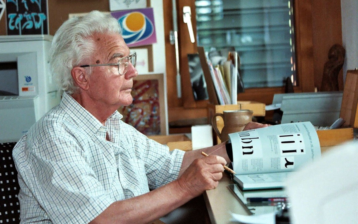
While the late Swiss type designer Adrian Frutiger (1928–2015) is best known for his renowned typefaces such as Univers, Avenir, and Frutiger, many people are less familiar with the symbols and monograms he designed. Here’s a selection from the sixties and seventies.
The quotes are from Frutiger’s book, Signs and Symbols (PDF via Monoskop), where he talks about the meaning behind simple combinations of basic shapes.

Centre International de Généralisation, Autoroute Rhone-Alpes, Philippe Lebaud.
“Triangles with a horizontal side form ideal backgrounds for signals (road signs, etc.) because of their symmetry. The triangle with a horizontal base conveys an impression of stability and permanence, like a pyramid.”

Jacqueline Iribe, Zee, Editions Hermann


“The normal cross or plus sign is the absolute embodiment of symmetry. The four right-angled inner spaces located around a central point fix the sign to the paper so strongly that any idea of movement or rotation is impossible.”
“For primitive humans, the circle was certainly of strong symbolic importance due to its association with sun, moon, and stars. Today, it is still associated with wheels and gears of every kind. Without the ability to travel, modern life on the ever-widening area of our daily world would be hardly imaginable. We will therefore use the circle form to establish some differentiation in the psychological effect on the viewer.”


Prache de Franclieu, Information et Entreprise, Brancher Frères.
“Two circles arranged vertically evoke the idea of a hierarchy, with upper and lower; the effect of the sign is of a rather precarious balance and it is like a statue or monument.”
“Signs, symbols, emblems, and signals, in all their diversity, are penetrating and deeply marking expressions of our times, pointing to the future by comprising and conserving something of the past.”

Signs and Symbols (PDF) was published in English by Van Nostrand Reinhold (New York), since acquired by Wiley.
More of Adrian Frutiger’s logos on Logobook.
Read more:
- How Paul Rand presented logos to clients
- Fonts Used In Famous Logos (With Download Links)
- Milton Glaser. The 'I heart New York' logo
- Marked with thought
- 7 Essential Tips to Follow When Designing a Logo
- 7 Killer Tips for Logo Design
- 5 Tried and True Design Devices for Logo Designers
- Wonderful Animated Logos That Transforms In Creative, Unexpected Ways
- How Paul Rand presented logos to clients
- Logofolio
- Why the shape of a company's logo matters
- Modern Art Movements To Inspire Your Logo Design
- Excellent Logos Created with Helvetica
- Euro Sign Design
- Harvey Ball. The designer of "smiley" icon
- Doodles from Google
- A Guide to Choosing Colors for Your Brand
Source: Logo Design Love.
Σχόλια
Δημοσίευση σχολίου